About this art
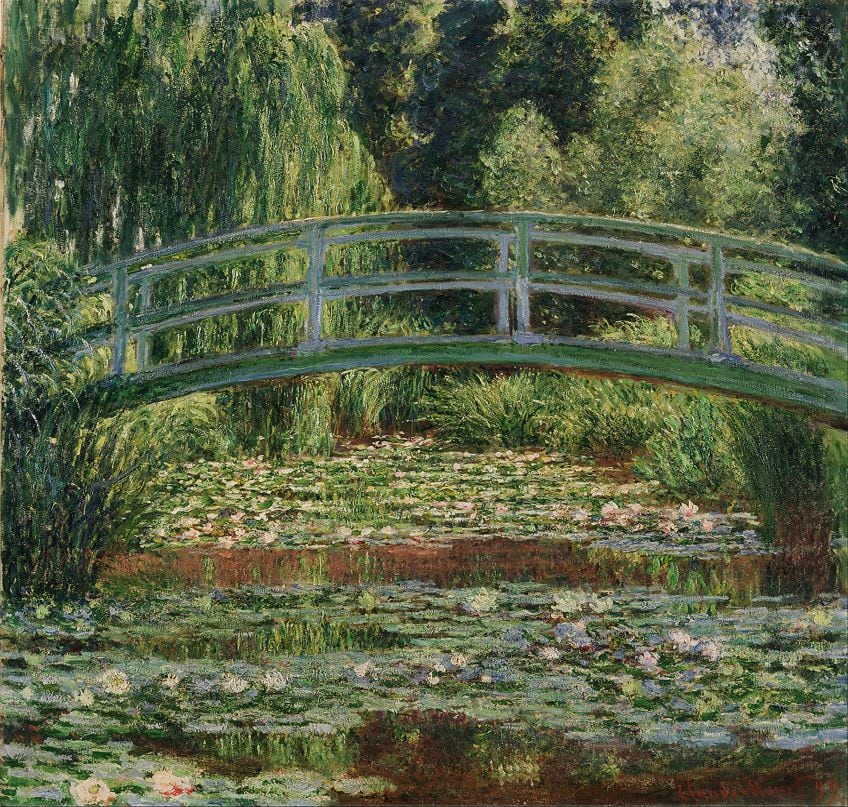
Claude Monet's work has always been simple but also complicated, it uses a lot of color, space, and texture. The image below is one of his famous paintings Waterlilies and Japanese Bridge. In this piece this artist used his space very uniquely, This gives off a lot of dimensions the bridge takes up the most space but you can see it in the setting, and the pond gives off the most depth with the lilys The color palette is demonstrated is very limited mostly greens but it brings out the contrast in the flowers and the bridge, with a darker background and lighter front. Without a good color palette it's hard to achieve what you want in a painting it sets the mood. Texture is another vital part of this, without the textures given mostly in the background it gives off a certain tone to the setting, without texture you would not be able to tell those were trees and branches in the background even though they are not very detailed it still sets the mood for the painting, His paintings are lazy but give meaning as his movements are more scattered and or blotchy. The painting was created in 1899 as part of the water lily series that he did, he was inspired by land near his property with a pond that he eventually created into a Japanese-style garden.
My Thoughts
I would own this style of painting for the hues and tones along with the simplistic details of this art, and the background of this painting I relate to I love creating a space that inspires me and continues to bring a creative space.
Bibliography
Hi Janae! I have always thought that Monet's Water Lily paintings are beautiful, but I've never thought about what makes them so appealing. I would agree with you that the simple, yet complex design of this painting gives it a lot of beauty. I noticed that the reddish brown color of the water stands out against the cooler, lighter colors in the rest of the painting. I like how you observed the scattered, blotchy brushstrokes Monet used. I think that the slightly blurry look these brushstrokes create gives the impression of movement in the trees and grass.
ReplyDeleteJanae, I agree with all of your comments on the color. Personally, it's one of my favorite things about this painting, the large amount of green and the lily pads remind me of when would I visit my family in South Carolina. Another thing that I like about this painting is the difference in brush strokes for the trees in the background. For example, the tree to the left has long downward strokes and incites images of a weeping willow, and the tree on the right has splotches of paint and reminds me of an oak tree. Anyways nicely done!
ReplyDelete